

Can’t Decide Between Coding and
Designing?
Can’t Decide Between Coding and
Designing?

Know More
+91-7058669996


 -By Harish Chopkar
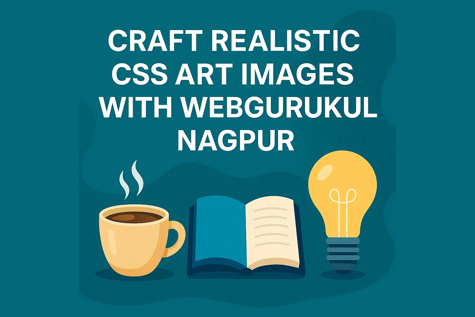
Imagine turning a blank webpage into a gallery of lifelike objects—a steaming coffee cup, an open book, or a glowing light bulb—all crafted with nothing but CSS! At WebGurukul IT Training and Placement Institute in Nagpur, our web development course unlocks the magic of CSS art tutorials, teaching you to create stunning, realistic designs that captivate users.
In this engaging blog, we’ll guide you through three creative CSS art projects—each designed to boost your imagination and sharpen your front-end skills. Whether you're a student or aspiring developer in Nagpur, this is your chance to build realistic UI elements using only HTML and CSS.
Creating realistic images with CSS is like painting with code—it’s both an art and a skill that sets you apart. In Nagpur’s booming IT scene, mastering realistic CSS designs at WebGurukul offers:
Eye-Catching Portfolios: Stand out with creative designs.
Advanced CSS Mastery: Use gradients, shadows, and 3D transforms.
Career Advantage: Shine in Nagpur’s competitive job market.
We use gradients, shadows, and animation to create a cup with depth and steam:
<div class="coffee-cup">
  <div class="cup"></div>
</div>

<style>
.coffee-cup { margin: 40px; position: relative; }
.coffee-cup .cup {
  width: 80px; height: 100px;
  background: linear-gradient(to bottom, #ffffff, #d2b48c);
  border: 4px solid #6b4f27;
  border-radius: 10px 10px 30px 30px;
  box-shadow: inset 0 -10px 20px rgba(0,0,0,0.1), 0 5px 15px rgba(0,0,0,0.4);
  position: relative;
}
.coffee-cup .cup::before {
  content: ''; width: 30px; height: 30px;
  border: 5px solid #6b4f27; border-radius: 50%;
  position: absolute; top: 25px; right: -35px;
}
.coffee-cup .cup::after {
  content: ''; width: 15px; height: 40px;
  position: absolute; top: -30px; left: 35px;
  background: linear-gradient(transparent, rgba(255,255,255,0.5), transparent);
  border-radius: 50%;
  animation: steam 2s infinite ease-in-out; opacity: 0.8;
}
@keyframes steam {
  0% { transform: translateY(0); opacity: 0.8; }
  50% { transform: translateY(-10px); opacity: 0.5; }
  100% { transform: translateY(-20px); opacity: 0; }
}
</style>
This uses transform, 3D effects, and repeating gradients for the pages.
<div class="book">
  <div class="cover"><div class="pages"></div></div>
</div>

<style>
.book { margin: 40px; perspective: 800px; }
.book .cover {
  width: 140px; height: 100px;
  background: linear-gradient(120deg, #4682b4, #5f9ea0);
  border-radius: 5px;
  transform: rotateY(-15deg);
  box-shadow: 10px 10px 20px rgba(0, 0, 0, 0.3);
  position: relative;
}
.book .cover::before {
  content: ''; width: 15px; height: 100%;
  background: #2f4f4f;
  position: absolute; left: -15px;
  border-radius: 5px 0 0 5px;
  box-shadow: inset 2px 0 5px rgba(0, 0, 0, 0.5);
}
.book .pages {
  width: 120px; height: 90px;
  background: repeating-linear-gradient(#fff, #fff 4px, #f0f0f0 5px);
  border-radius: 3px;
  box-shadow: inset -3px -3px 8px rgba(0,0,0,0.1);
  position: absolute; top: 5px; left: 10px;
}
</style>
We combine radial gradients and glowing effects to simulate glass and filament.
<div class="light-bulb">
  <div class="bulb"><div class="filament"></div></div>
</div>

<style>
.light-bulb { margin: 40px; }
.light-bulb .bulb {
  width: 60px; height: 90px;
  background: radial-gradient(circle at 50% 20%, #f0f8ff, #b0c4de 90%);
  border-radius: 50% 50% 20% 20%;
  position: relative;
  box-shadow: 0 8px 20px rgba(255, 223, 0, 0.5), 0 4px 10px rgba(0, 0, 0, 0.4);
}
.light-bulb .bulb::before {
  content: ''; width: 30px; height: 25px;
  background: linear-gradient(to bottom, #999, #555);
  position: absolute; bottom: -25px; left: 15px;
  border-radius: 4px;
}
.light-bulb .bulb::after {
  content: ''; width: 30px; height: 4px;
  background: #aaa;
  position: absolute; bottom: -5px; left: 15px;
  border-radius: 2px;
}
.light-bulb .filament {
  width: 10px; height: 30px;
  background: linear-gradient(to top, #ffcc00, #ff9900);
  position: absolute; top: 30px; left: 25px;
  border-radius: 5px;
  box-shadow: 0 0 15px rgba(255, 165, 0, 0.8);
}
</style>
From a steaming coffee cup to a glowing light bulb, pure CSS art can create realistic visuals that boost creativity and technical confidence. At WebGurukul, our website development training in Nagpur teaches students how to bring ideas to life with CSS, HTML, and JavaScript. Enroll in our next batch or book a free demo to start your creative coding journey today!
Thank you
Harish Chopkar is a seasoned IT professional with over 10 years of extensive experience in the tech industry. His expertise spans a wide range of technologies, including C, C++, Python, MERN, and MEAN Stack, as well as DotNET and Laravel. With a deep understanding of more than 40 subjects related to computer science and IT, Harish has consistently demonstrated his ability to tackle complex challenges and deliver innovative solutions. His diverse skill set and passion for technology have made him a go-to expert for organizations looking to leverage the latest advancements in software development. Harish's dedication to continuous learning and his commitment to sharing knowledge make him a respected figure in the IT community.


Code Your Way to Success!
Join us and take your first step towards the IT industry.